Oman today_ Purple is one of those colors that, depending on its intensity and tone, can create a luxurious, modern, mysterious, or even romantic look. To find successful combinations with this color, it is not enough to simply refer to terms like “warm colors” or “neutral colors.” It is essential to consider the principles of color theory, the placement of colors on the color wheel, and the context in which the color will be used.
1. Complementary Combinations
On the color wheel, yellow sits directly opposite purple, creating the strongest contrast. Lemon yellow brings an energetic and modern vibe, mustard yellow adds a warm and classic feel, and gold creates an opulent and luxurious atmosphere. Such combinations work well for branding that aims to attract attention, modern interior design, or standout fashion pieces.
2. Analogous Combinations
Colors adjacent to purple on the color wheel create a sense of harmony and continuity. Magenta offers a feminine and delicate touch, lilac conveys calmness and softness, and indigo deepens the sense of mystery. These combinations are ideal for bedroom designs, formal outfits, or brands with a refined and unique identity.
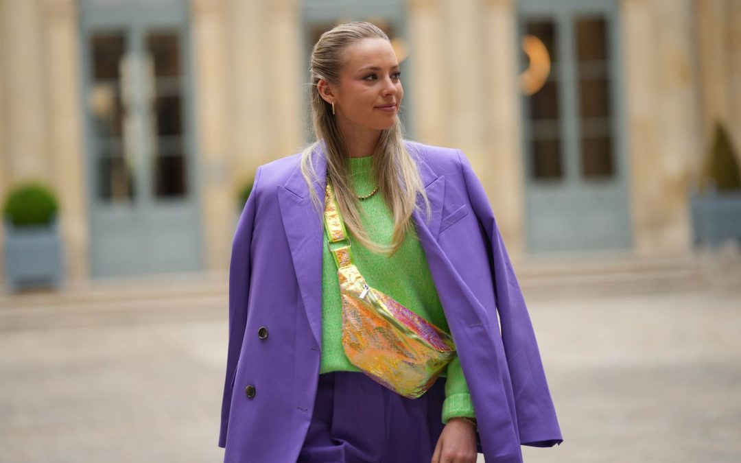
3. Triadic Combinations
Choosing three colors evenly spaced on the color wheel creates a balanced and visually appealing mix. For purple, the other two colors are green and orange. Emerald green paired with purple evokes a regal feel, while burnt orange adds an artistic and distinctive flair. These combinations are perfect for posters, creative packaging, or bold fashion styles.
4. Neutral Pairings
Pairing purple with neutral colors allows it to shine as the main color. Silver-gray creates a modern and minimal look, black enhances depth and luxury, cream white adds softness, and beige or light tan provides a traditional or warm touch. Such combinations are widely used in formal décor, business cards, or professional attire.
5. Temperature-Contrasting Combinations
To create energy and visual dynamism, you can pair purple with colors of different temperatures. Tomato red makes a bold statement, dusty pink maintains softness alongside purple’s strength, and warm brown or brick red gives a space an artistic or classic vibe. These combinations are striking in antique-inspired interiors, book covers, or art pieces.
Key Tips for Using Purple
Lighting plays a major role in how a color is perceived. Warm light makes purple blend more harmoniously with beige and earthy tones, while cool light complements it with silver and blue. The tone of the purple also matters: light purple pairs best with pink and white, while dark purple looks more luxurious with gold and olive green. In digital design, it’s also important to ensure enough contrast so purple doesn’t fade alongside similar shades.